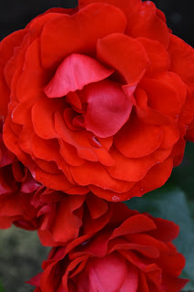
From looking at the lastimage, i wondered what would happen if i reduced the saturation, and made the S curve layer deeper. and i feel the outcome looked quite vintage, as it retained a Sepia tone.
Jodie Louise Art
College Photography Unit
Wednesday, 29 August 2012
On this image, i also changed the orientation. I then altered the saturation of te image, and upped the levels of magenta and red, whilst lowering the blues. I then added a very small amount of the cubism filter, and then re changed the colour gradient curves again. i then also edited the levels, moving the gray bar more toward the white, deepening the image.
With this edit, i found i didnt like the final outcome. i began with altering the image curves to start making a hipstermatic image, however i then began playing with the levels of the image, and i also added the Neon adjustment. i liked the way that the red background turned out, but i ddnt like te rest of it.
in the edited image, I altered the orientation, and lowered the saturation to zero in order to make this black and white. Before this, i changed the colour hues in order to make the colour contrast more vivid for when i altered the image into black and white. i feel this image is successful, however i wish that the image was more defined.
Here i found with a photography i took, that it was far too dark:
so with the above edit, i alltered the levels on the image, movinng the grey level closer to the white, and the white level closer to the black. i then altered the brightness and changed the contrast. i like this image as it was inspired by cindy sherman
so with the above edit, i alltered the levels on the image, movinng the grey level closer to the white, and the white level closer to the black. i then altered the brightness and changed the contrast. i like this image as it was inspired by cindy sherman
Wednesday, 15 August 2012
Mathew Shave
Matthew shave is a makeup and fashion photographer. i especially like his work for how fresh and clean cutting it is. The vibrant colours used also contrast to his other images which as almost clinical in comparison, using white and flesh tones.
7/10
7/10
Simon Norfolk
Simon Norfolk is a War Photographer, taking most of his images in the war in iraq. The content of his images are distressing, mainly because the images he captures are those which as usually hidden by common media insight into the current wartime situations.
I feel his images are liberating in themselves as they show the public eye hidden truths.
9/10 as the images are incredibly successful as showing people behind the scenes information.
I feel his images are liberating in themselves as they show the public eye hidden truths.
9/10 as the images are incredibly successful as showing people behind the scenes information.
Subscribe to:
Comments (Atom)


